Regime Change for the Dollar
We're going back to the days when strong US data would weigh on the Dollar

The US releases gobs and gobs of data, but the only data release markets really care about is payrolls. Back in my days on Wall Street, there was constant chatter and noise on Goldman’s FICC (fixed income, currencies and commodities) trading floor, but this would turn to deathly silence in the minutes before payrolls. If payrolls were strong, the trading floor would erupt into cheers and calls of “USA, USA, …” If they were bad, you’d get a collective groan of disappointment. No other data release does that.
Yesterday’s payrolls and the reaction of the Dollar marked an important turning point. Ever since 2014, positive data surprises have pushed the Dollar higher, but this wasn’t always so. In the years after the 2008 crisis, the Fed used multiple QE programs to cap Treasury yields. This caused markets to sell the Dollar when data surprised positively, because markets believed positive surprises - with the Fed acting in this way - pushed down real rates. With all the political pressure on the Fed, my view is that we’re going back to this negative correlation, which is why I switched to forecast Dollar weakness in my preview post for 2026.
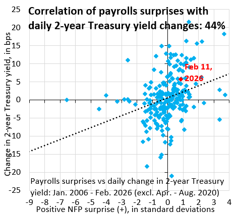
The chart above shows monthly payrolls surprises relative to Bloomberg consensus on the horizontal axis (in standard deviations) and the change in the 2-year Treasury yield on days when payrolls are released (in basis points) starting in January 2006. There’s a positive correlation between the two as you’d expect: an upside surprise causes yields to rise on expectations of tighter monetary policy. Indeed, yesterday’s jump in 2-year yield was slightly above the norm, which is what I’m indicating with the black dotted regression line. Markets think the Fed will tighten more strongly than in the past.
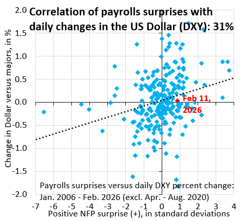
You’d think yesterday’s upside surprise and the rise in 2-year yield would lift the Dollar, but that didn’t happen. The chart above has the same payrolls surprises on the horizontal axis, but now has the percent change in the Dollar versus the majors on the vertical axis. The Dollar was flat, which is pretty remarkable given the move in rates. I see this as a sign that we’re on our way to the correlation switch, whereby the Fed is seen as increasingly politicized, causing markets to sell the Dollar on strong data.
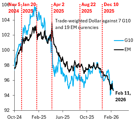
This correlation switch is why - in my opinion - we yesterday made a new low in the Dollar versus emerging markets (EM), which is what the black line in the above chart shows. This index is the best leading indicator for Dollar direction because it’s far less volatile than the Dollar versus the G10. We’re entering a new era. US growth will boom this year. But the Dollar will fall.
Forgive my ignorance,I am new in macro economics and security analysis- just one cycle in lol. My observation on yesterdays data was there was a strong bench mark revision by quite a bigger margin and it ended up confirming the US just created on average 15,000 jobs per month,this was was an indication of a structural shift in the labor market towards deceleration and it was not as strong as people had thought,as much there was job growth,there was an underlying weakness in the labor market,so the investors did not really position themselves as a strong repricing and that is why there was such a reaction.
Agreed